
Introduction: Understanding Colour Beyond Appearance
Colour plays a major role in the identity of Ajrakh textiles. A deep blue background, strong red details, dark outlines and pale patterns can transform a simple piece of fabric into a visually rich design. These colours do more than decorate the surface. They help define individual motifs, separate repeating shapes and create the contrast that makes Ajrakh patterns recognizable.
The phrase Ajrakh color blocking meaning invites us to look at how these colours work together. In contemporary fashion, colour blocking often means placing large areas of contrasting colours beside one another. In Ajrakh, the idea can also describe how distinct colour zones interact within a printed pattern. However, traditional Ajrakh printing does not always use large, solid blocks of colour. Its visual structure often comes from repeated motifs, fine outlines, resist-printed areas and carefully layered colour.
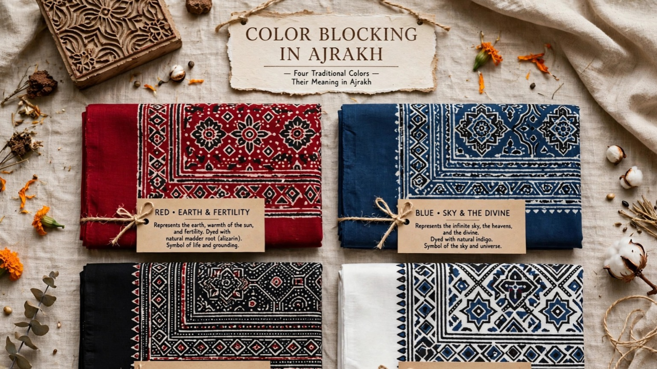
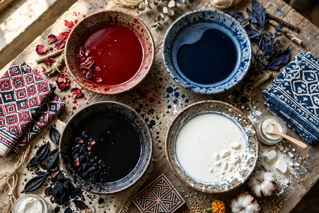
Four colours frequently draw attention in Ajrakh designs: red, blue, black and white. Indigo can produce rich blue shades, madder can contribute red tones, iron-based preparations can help create dark shades, and resist materials can protect selected areas from particular stages of dyeing. The exact results depend on the recipe, fabric, water, processing method and artisan’s experience.
Understanding these colours means examining both their visual effects and their place in the printing process. It also means avoiding the assumption that every colour has one fixed symbolic meaning across all Ajrakh traditions.
The Core Palette
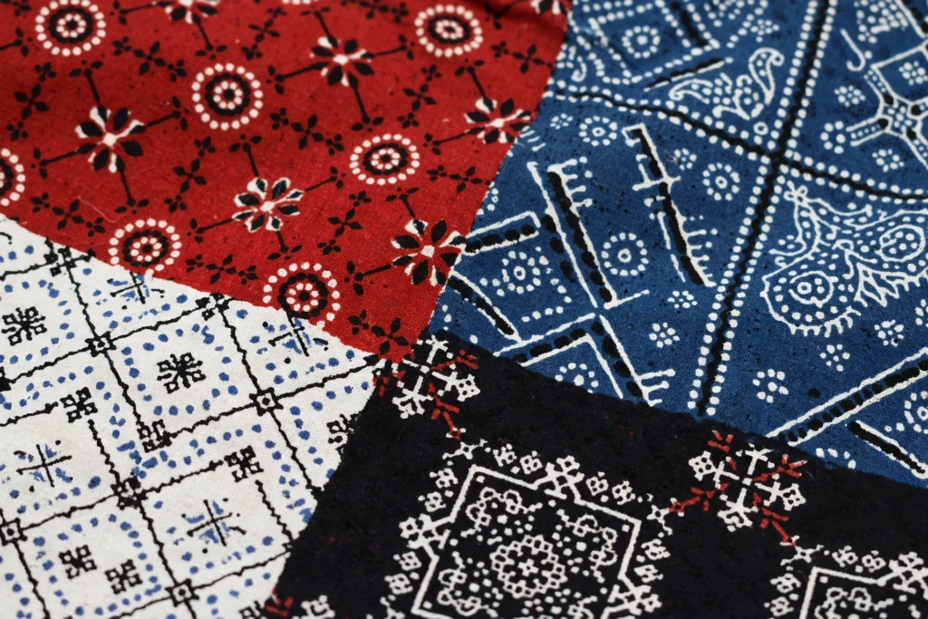
The classic Ajrakh palette often relies on a strong relationship between red, blue, black and pale or white areas. Each colour has a different visual role, and their contrast helps the pattern remain readable even when the design contains many small details.
Blue can provide a broad visual foundation. Red introduces warmth and draws attention to selected motifs. Black defines outlines and strengthens the contrast between neighboring shapes. White or undyed areas create breathing space, allowing other colours to stand out.
These roles can change from one design to another. A predominantly blue textile may use red sparingly as an accent, while another design may distribute red and blue more evenly. Black can appear as a major part of the pattern or as fine detail around other colours. White areas may form a prominent background or remain as small shapes within individual motifs.
The palette works because the colours support one another. Red and blue create a strong warm-cool contrast, while black adds visual weight. White or pale areas interrupt dense patterns and help the eye distinguish one shape from the next.
Although this combination has become closely associated with Ajrakh’s visual identity, not every Ajrakh textile uses all four colours in the same proportions. Contemporary interpretations may introduce additional shades, and traditional pieces can vary according to their intended design and production method.
Indigo Blue: Depth, Contrast and the Foundation of the Pattern
Indigo is one of the best-known dye sources associated with traditional blue textiles. In Ajrakh printing, indigo can produce shades ranging from softer blue to deep navy, depending on the dye bath, fabric preparation and processing conditions.
Blue often gives an Ajrakh design its sense of depth. A dark blue ground can make red motifs appear brighter and help pale areas stand out. When artisans arrange several shades or use blue alongside black, the resulting contrast can give the pattern a layered appearance.
The visual effect also depends on how much blue appears across the fabric. A design with a large blue area may feel visually grounded, while small blue details surrounded by red, black or pale areas can create a more fragmented rhythm. Repeating blue shapes can connect separate parts of the composition and give the eye a route through the pattern.
Indigo’s importance is also practical, not merely visual. Natural indigo dyeing involves a process in which the soluble form of the dye penetrates the fabric and then oxidizes when exposed to air, developing its characteristic blue colour. Traditional dyeing requires knowledge of the dye bath and careful handling of the textile.
The final shade does not depend on indigo alone. Fabric type, preparation, dye concentration, repeated dipping and finishing can all influence the result. Two textiles described as indigo-dyed may therefore show noticeably different blues.
It is also important not to interpret blue as having one universal meaning. People may associate it with calmness, depth or coolness, but those responses can vary by individual and cultural context. In a particular Ajrakh design, blue’s most clearly observable role is the way it establishes contrast, connects motifs and shapes the overall colour balance.
Madder Red: Warmth and Visual Emphasis
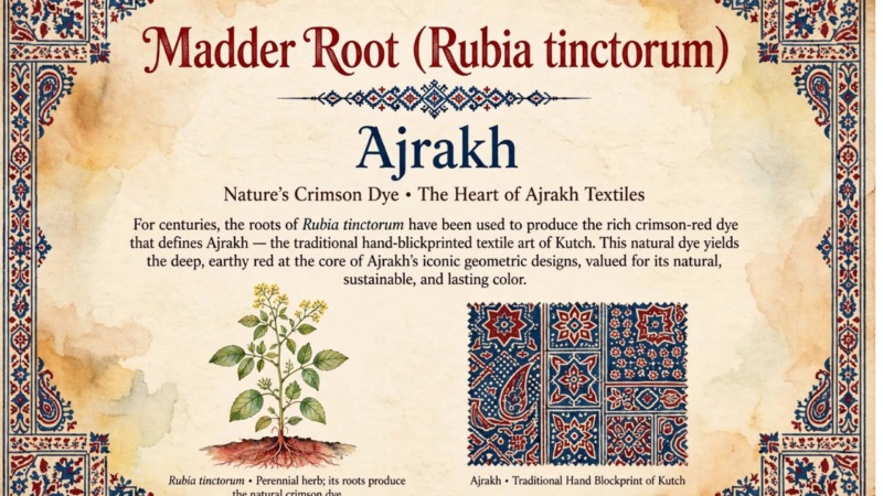
Red provides a strong counterpoint to indigo blue. In traditional dyeing, madder roots can produce red and reddish shades, although the final colour depends on the plant material, preparation, mordants and dyeing conditions. Other recipes and modern processes may produce different red tones.
Within an Ajrakh pattern, red can direct attention towards particular motifs. When artisans place red details against blue, the difference in temperature and hue makes each colour more noticeable. Red may highlight small geometric shapes, strengthen a repeating arrangement or create a warm visual line across the fabric.
Its placement matters as much as its intensity. A pattern with red spread evenly across the surface can feel consistent and rhythmic. A design that concentrates red in certain areas can create focal points. If red appears alongside black outlines and pale resist details, those surrounding elements can make its shape clearer.
Madder dyeing also demonstrates how colour depends on craft knowledge. Natural dye materials do not always produce an identical shade in every batch. Factors such as the quality of the dye material, the fabric’s preparation and the recipe can change the final result. These variations make accurate colour descriptions and careful production records important.
Red can carry cultural associations with celebration, energy or auspiciousness in particular settings, but it would be misleading to assign one meaning to every red Ajrakh textile. The color’s symbolism depends on context, and a pattern may use red primarily for visual contrast.
When evaluating an Ajrakh saree or fabric, look at how the red interacts with the other colours. The best-balanced design does not necessarily use the brightest red. It uses red in a way that supports the motif structure and the overall composition.
Black: Defining Shapes with Iron-Based Colour
Black provides some of the strongest visual definition in many Ajrakh patterns. It can create outlines, separate neighboring motifs and emphasis the boundaries between co loured sections. Even a relatively small amount of black can make the surrounding red, blue and pale areas appear more distinct.
Traditional Ajrakh processes can use iron-based preparations to produce dark shades. These preparations may react with tannin-containing materials to form dark compounds. The exact recipe and method vary among artisans and production traditions, so not every black shade comes from an identical process.
The printing role of black is especially important when a design contains fine geometry. A dark outline can make the edges of a motif easier to distinguish. When repeated across the fabric, those outlines create a consistent visual rhythm. In a dense pattern, black can also help prevent individual shapes from blending into one another.
Black can change the balance of the palette. A large area of black may make a textile feel bold and high-contrast. Fine black details can create precision without overwhelming the other colours. The result depends on the proportion of black, the size of the motifs and the amount of pale space around them.
The printing process also requires attention to fabric and dye chemistry. Iron-based preparations need suitable handling because an inappropriate recipe or excessive treatment can affect textile fibers. Skilled artisans manage the process according to the materials and desired result.
Although people may associate black with strength, elegance or formality, those associations are not universal rules for Ajrakh. Its most direct design function is often structural: black establishes boundaries, sharpens details and gives the pattern definition.
White and Resist: Creating Space Within the Design
White areas create contrast in Ajrakh by separating co loured motifs and giving the pattern room to breathe. In some textiles, these areas may represent undyed fabric; in others, pale tones can result from the particular printing and dyeing sequence. The actual appearance depends on the production method.
Resist printing helps artisans control where colour develops. A resist material covers selected areas of fabric so that a particular dye does not reach them in the usual way. The artisan can then remove or retain the resist according to the process. Traditional Ajrakh production may involve several printing and dyeing stages, making the sequence important to the final design.
Resist areas are not simply empty spaces. They actively shape the pattern. A pale line can separate two dark shapes, a small undyed motif can interrupt a dense background, and repeated pale dots can establish rhythm across the fabric.
Without these lighter areas, a pattern that uses strong red, blue and black could look crowded. White creates contrast while allowing the individual motifs to remain readable. It can also make a design appear more intricate because the eye notices the boundaries between positive and negative space.
The balance between co loured and resist areas matters. A design with larger pale sections may feel open, while one with small white details inside dense colour fields may look more intricate. Neither arrangement is inherently better; each creates a different visual effect.
The term white also needs care in product descriptions. A pale area may look white in a photograph but appear cream or off-white in person because of the fabric, lighting or camera settings. If exact colour matters, review several images and the seller’s fabric details.
How the Four Colours Work Together
The Ajrakh palette becomes most interesting when we examine the relationships between its colours rather than judging each one separately.
Blue and red create a warm-cool contrast. Their interaction can make a repeating motif easier to notice, particularly when both colours appear in clearly separated areas. Black then sharpens boundaries, helping the eye recognize the structure of the design. Pale or white sections interrupt the stronger colours and prevent the overall pattern from becoming visually uniform.
Consider a geometric motif printed with a blue area, a red center, dark outlines and pale spaces between the elements. Blue establishes the main field, red draws attention towards the center, black clarifies the shape and white separates the details. Each colour performs a different task, but the motif succeeds because those tasks work together.
Proportion can change the result dramatically. If a design uses a lot of blue and only small amounts of red, the textile may appear cooler overall. If red occupies a larger area, it may become the dominant visual feature. More black can make the pattern look sharper, while more pale space can soften the contrast.
The placement of colours also matters. A balanced pattern does not necessarily distribute every colour equally. Instead, it arranges colours so that the viewer can recognize the motifs and follow the design across the fabric.
This is where colour blocking becomes a useful way to discuss Ajrakh. Rather than assuming the textile contains only large solid panels, we can use the term more broadly to describe the placement of distinct colour areas within a repeating pattern. The phrase should clarify the design, not replace an accurate description of the printing process.
Natural Dyes, Resist Materials and the Printing Sequence
Ajrakh colour depends on more than the dye name written on a product label. The finished textile reflects the relationship between fabric preparation, printing, resist application, dyeing and finishing.
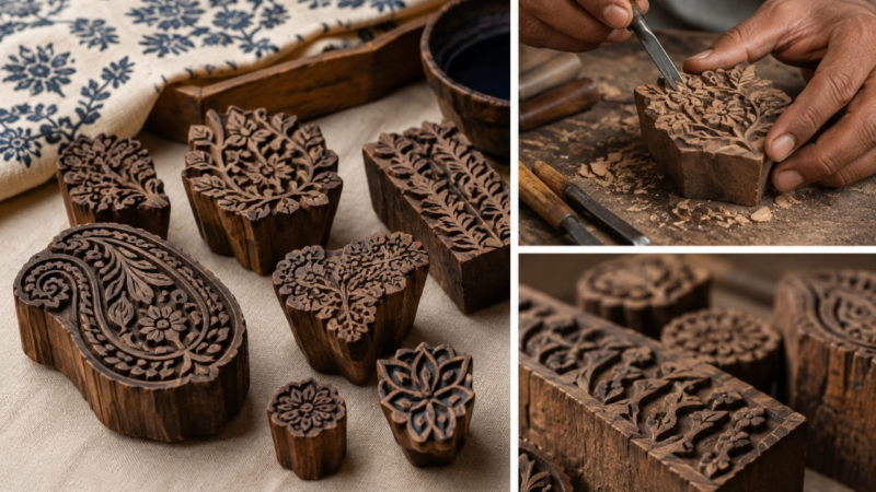
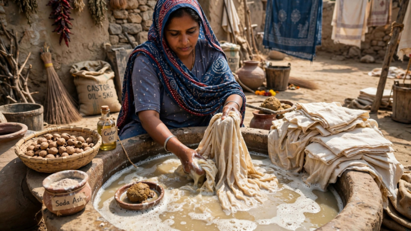
In traditional production, artisans may prepare the fabric before printing to help it accept colour and respond correctly to later stages. They apply selected materials with carved blocks, then use dyeing and resist techniques to develop the intended pattern. Some designs require several stages to build their colours and details.
Natural indigo and madder can produce characteristic blue and red shades, while iron-based preparations can contribute dark tones. Resist materials protect selected areas from certain stages of colour application. The exact sequence depends on the design and the artisan’s method.
These processes require experience because the materials interact. A change in fabric preparation or dye concentration can affect the final shade. Incorrect alignment can disrupt the relationship between a motif’s outline and its co loured sections. Poorly controlled processing can also affect consistency.
Not all products sold as Ajrakh use identical materials or traditional methods. Some makers use natural dyes, while others may use different dye systems or contemporary production techniques. Buyers should look for clear information from the producer rather than assuming that every Ajrakh-labelled product uses natural indigo, madder and iron-based preparations.
A useful product description identifies the fabric and printing method accurately. If a brand claims that a textile uses natural dyes or traditional resist printing, that claim should be supported by clear production information.
Colour Blocking and the Visual Rhythm of Ajrakh
Colour blocking helps us understand how the eye moves across a patterned surface. In Ajrakh, the arrangement of colours can create rhythm even when the design repeats the same basic motif.
Repeated blue areas may establish continuity across the fabric. Red elements can punctuate that repetition, while black outlines make the boundaries easier to follow. Pale sections create pauses between the stronger colour areas. Together, these elements form a pattern that can feel both structured and lively.
Scale also affects visual rhythm. Large areas of colour are visible from a distance, while small details become apparent when someone looks closely. A textile may therefore reveal two different experiences: an overall colour arrangement from far away and a complex network of individual motifs at close range.
The fabric’s drape can change the effect. Folds may conceal part of a motif or bring two separate colour areas close together. A saree with a strong blue ground may appear mostly blue when draped, even if its flat layout includes substantial red and black detail.
When viewing an Ajrakh textile online, compare a full-length photograph with close-up images. The full view helps you understand the colour balance, while the close-ups reveal the printing details. Both perspectives matter when judging whether the design suits your taste.
How to Choose an Ajrakh Palette for Your Style
Colour preference is personal, so the right Ajrakh palette depends on the look you enjoy and how you plan to use the fabric.
If you like a deep, grounded appearance, you may prefer designs that use substantial blue and black. If you enjoy warmer contrast, look for a pattern where red plays a more visible role. If you prefer a lighter visual effect, pay attention to the amount of pale or white space in the design.
Think about the garment as a whole. A sarees body, pallu, border and blouse piece may distribute colours differently. A red detail that looks small in a flat photograph may become more noticeable when the pallu falls over the shoulder. Likewise, a dark border can frame the saree and influence the overall appearance.
Consider your existing wardrobe as well. A colour palette that complements the blouse pieces, accessories or garments you already own may be easier to style. However, you do not need to follow strict rules about matching every shade.
Before buying, check the product description for fabric composition, care instructions and printing method. Review the seller’s photographs under different views, and remember that screens can alter the appearance of colours.
Most importantly, choose the palette because you like its visual character. Understanding the design helps you make a more informed decision, but no colour combination is automatically more authentic or more beautiful than another.
Frequently Asked Questions
1. What does Ajrakh color blocking mean?
Ajrakh color blocking describes how distinct colours such as blue, red, black and pale resist areas work together within a patterned textile. Traditional Ajrakh often uses repeating motifs and layered printing rather than only large solid panels.
2. What does blue represent in Ajrakh?
Blue often creates depth and provides a visual foundation for other colours. Indigo can produce blue shades in traditional dyeing, but blue does not have one universal symbolic meaning across all Ajrakh designs.
3. How does madder create red in Ajrakh?
Madder roots can provide red and reddish shades in natural dyeing. The final result depends on the dye recipe, fabric preparation, mordants and processing conditions.
4. Why does Ajrakh use black outlines?
Black can define motif boundaries, strengthen contrast and help intricate patterns remain clear. Traditional processes may use iron-based preparations to produce dark shades, although methods vary.
5. What does white mean in an Ajrakh print?
White or pale areas create contrast and separate co loured motifs. In resist printing, selected parts of the fabric can remain protected from particular dye stages, helping create the pattern.
6. Are all Ajrakh textiles made with natural dyes?
No. Materials and production methods vary. Check the maker’s information if you specifically want natural indigo, madder or other traditional dye materials.
7. Why do Ajrakh colours look different in photographs?
Lighting, camera settings, screen displays, fabric texture and dye variations can all affect how a colour appears. Compare several images and check the seller’s description before purchasing.
8. How can I identify a well-balanced Ajrakh colour palette?
Look at how blue, red, black and pale areas relate to one another. The motifs should remain easy to recognize, and the overall arrangement should suit your personal preference. Colour balance alone does not prove authenticity or quality.
Conclusion: Seeing the Design Through Its Colours
Ajrakh’s red, blue, black and white palette shows how colour can organize a textile as well as decorate it. Indigo blue can create depth, madder red can introduce warmth, iron-based dark shades can define shapes, and resist areas can create contrast and space.
The meaning of these colours depends on context. Their visual roles are easier to establish than universal symbolic meanings, and the precise dyeing methods can vary from one maker to another.
When you examine an Ajrakh textile, look beyond the individual shades. Notice their proportions, the way they separate and connect motifs, and how the pattern changes across the body and pallu. This approach reveals the thought behind the design and helps you appreciate Ajrakh as both a colour system and a skilled textile craft.